|
Through this project, I gained a new love for prisma colors. The most useful and repetitive technique I used was directional lines. This was really important for giving the plants their shape and smooth texture. Another helpful technique was using baby oil to blend my lines and colors. Without this step, I feel like my piece would not look as complete. I used a lot of burnishing to achieve depth and a saturation of color as well as layering of colors to achieve true shadows and hues in the plants. tThis prisma project taught me how to properly use prismas. Initially I thought I had enough experience but with the techniques I learned and more practice, I became aware that I actually knew very little. I learned about burnishing, which helped make my piece have the color depth it does. My challenges were shadows and perception. I had to use unlikely colors for my shadows to achieve something more vivid and natural, and this was difficult for me. Perception was the hardest for me becuase my photos were taken at an aerial view, and I've learned it's not as easy to show depth and detail this way. I would complete this project by filling the page with more plants of a different variety. This would make the piece complete. I would add more depth to the plants by drawing soil underneath with a cool undertone. I would enhance the plants by adding highlights with a gel pen. 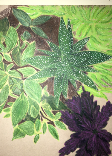
0 Comments
For my trite symbol I chose the female gender symbol. I used this in an original way by drawing two separate symbols in one; an apple and the figure of a woman. A distant symbol of an apple is used to reference the anatomy of a woman. And for obvious reasons, the figure of a woman represents a female. I then chose to blend these objects by placing the females figure in a way the more clearly represents what the apple means. This was not meant to be perceived sexually but to give a more clear impression of what the apple represents.Another symbol I used was flowers. These surround the woman in my painting and this was actually not intended, but flowers show feminism. 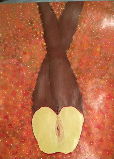 i don't think my composition is the strongest in this piece but it does focus your eyes to the middle. I did this by placing the figure in the middle. Also I feel that the contrast between the apple and the skin tone really draws the focus to the apple. And by making the background complex and more textured than the figure in the middle which has smooth strokes creates a contrast that is not typical.
I don't think this piece was the successful because I am not pleased with the quality of my work. Even though I spent a lot of time on this, I feel like my time wasn't spent improving my technique but on trying to get a consistent color and texture. I'm not happy with the flower background I chose. I had planned to paint large overlapping flowers, but I did them last and I wasn't happy with how they were looking. Also my color palette does not appeal to me. Individually I like the colors I used but as.a whole I don't think there is as much contrast as planned. |
 RSS Feed
